22 December 2014

Coal Express

Merry Christmas!  When I set out to do this card I wanted to do a gamut mask.  As I was trying to figure out which colors to use, I started to get frustrated, and it wasn't going in the direction that I was seeing in my head.  I'm still trying to get comfortable with the whole gamut-masking technique, but I decided to try David McClellan's blog post about wams/cools/saturation.  I don't completely grasp it, however, I learned so much!  for example,

below, the image is completely done in blues, but the more desaturated, the color appears more red when next to the rest of the more saturated blues!  It's pretty fantastic.

I'd also like to note, that it was fun not using any layer effects or even any layers with opacity changes!  I used a gradient on the background, and I did a levels adjustment at the end because my monitor causes me to print too dark when I go to print things.  other than that it was our digital paint and no trickery.


above:  This was my original attempt with a gamut mask.  As you can see, I originally had a completely different direction in mine.  I hadn't gotten far before I got frustrated and wanted to try something else.


above: This was a little bit of value lay-in before I realized I needed to reach out to understand what I wanted to accomplish.  I didn't want it to be just blue, but wasn't sure how to introduce more color in to it so the image was color-cohesive.

23 November 2014

sketchbook

Just a shot of a couple of my sketchbook pages.  the Mexican musician at the right spawned from the hat shape.  i can't remember why that shape was there, but I decided to brainstorm outwardly from it, and it grew into that, i guess.

the next page is just an orc-type creature.  I really don't like the confining space that a sketchbook provides, but it is important to keep sketching, and it's therapeutic even tho I throw plenty of tantrums in the name of suckery.


25 October 2014

A knight, 3 men in a tub

a sketchbook spread.  I decided to take the knight into PS and paint him, but leave the other page in there as well.  I didn't use any reference of any kind, and it is evident.  I don't have references available when I'm drawing during my lunch hour in the car though, haha.  

I decided to use a super narrow gamut mask with a spot color.  I didn't end up using the blue.  I used the blue-green instead, for the atmosphere.  the image is really dark, but overall I really like the roughness of the brush that I am using.  


below is the gamut mask that I chose my colors from


14 October 2014

Castle Orangeskull color

Im still trying to understand color gamuts and color/light.  It took me awhile to figure out what colors to use, and get comfortable using odd colors together.  I think I'm on the right track, but I'm not entirely happy with this.  There are things I really like about it.  

The learning process has been really fun.  If I could afford Sam Neilson's color class I would totally take it and I feel like I could really learn a lot.  some day maybe.

"By the Power of Orangeskull!  I have the power!!!!" 

haha.


09 October 2014

The Frankensteins

Had some fun trying to understand gamut masking that I read about on James' Gurney's wonderful blog.  I'm trying to get a feel for choosing a color gamut and still be able to create colors and values.  I also tried a "traditional" brush that I hadn't really tried before, and I'm pretty pleased.  I really like some of the color variations that I was able to achieve.

I'm still uncertain if the color gamut masking allows me to use different values than are shown.  I mixed some of the colors, obviously, but doing it digitally is dangerous because it seems like I get outside of the gamut at times.  is that possible?  I'm not sure.  but I liked what happened on this one.

I would have liked to use some brighter values in some areas, but I also really like the feeling of this painting.  chalk it up to experience and learning from trial and error.


here is the Gamut that I but out and color-picked from.  I mixed colors from this gamut as well.


05 October 2014

Inktober 2014

It's inktober!  These are a few sketches from my sketchbook.  Halloween is one of the most fun themes to draw.  It just never gets old to me.  

Now If I could get the time to do an actual painting...I'm way overdue.


23 February 2014

Bris-baneling

24 April 2014.  Finished.  For some reason it changes the colors and brightness when I post this here. we will see how my brother likes this, and hopefully there isn't a ton of adjusting I will have to do for it to be printed correctly.


19 April 2014.  Ok, a process shot.  I haven't worked on this much, but when I do I really enjoy it because I continue to learn a lot.  still have a long way to go.


I told my brother that I would do a painting for him months ago.  He had a kid and named him Brisbane.  He also happens to really love Starcraft, and enjoys banelings.  so I thought it would be fun to have a pic of Brisbane riding atop a baneling.  It is still in the works (it has been for months) but I am sure I will eventually finish it.  I bet I could finish it up in a day or so.  But why get it done today if I can do it tomorrow?  or the next day?

anyway, here is a process pic:


23 January 2014

Complexity

right: a little PS trickery / left: the original sketch
burnt sienna acrylic washes, white pastel pencil, black prismacolor pencil.


A new year begins, and with a lot of other people, I have opted in to the "new year's resolution" business.  one of them, that is pertinent to this blog, is to draw 2 pages in my small sketchbook every day.  That isn't a lot, but it is meant to force me to draw.  I started out well, but changes at work and home have made it difficult and sometimes down right impossible.  But I am making progress, and I guess that is what is most important.

Drawing in your sketchbook shouldn't be a difficult task.  It is supposed to be fun; a way to open your mind and let go.  But for me it simply isn't.  It is difficult for me, and I never really understood why I dreaded it.  
A great friend of mine, Matthew Walker, wrote a wonderful blog post about "complexity".  as I read it I realized why I didn't like drawing in my sketchbook as much.  It was sort of a revelation.  here is what I wrote in response to his post (as I held my squirming child, so please forgive the post as it doesn't sound super coherent).

"... I feel like I can relate to this in a lot of ways, but recently I have started having a hard time even doing sketches in my sketchbook. something that should be so simple and non-threatening becomes a huge chore and something that I dread. something that I have to prepare myself for. 
The empty white page needs to be filled with something magical....aaaand then I just can't begin, and find something else to do, effectively flipping the bird to my New Year's resolution. 
I find that if I just keep it simple, and not make it so "complex" a process, I find it more successful and gratifying. and sometimes it ends up being complex, but that is because the process that started out simple was able to grow into itself."

So.

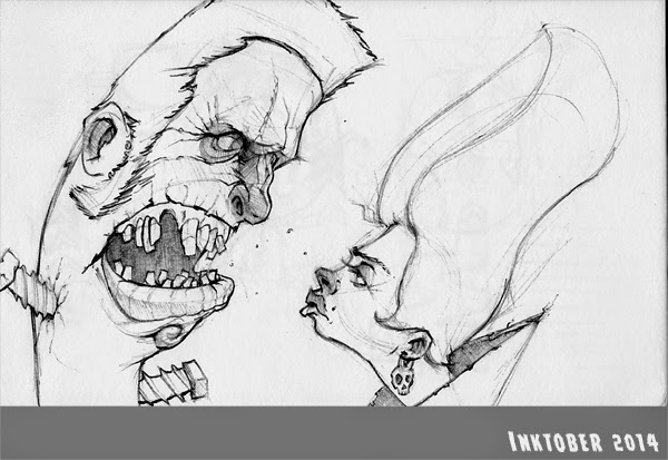
the above sketch is an example of what I mean.  it doesn't seem super simple compared to the other sketches I have posted.  but the difference is, that I approached it simply.  I didn't have any motivation to create something great - only a motivation to explore media and technique.  it turned into something more "complex" because I chose to keep going and try new things.  but it was simple at it's inception.

Also,

I have found that many of my most "successful" images are images where I don't use line as much as I carve an image out with values and textures.  I would really like to be a better draftsman.  but it is super frustrating, because I'm not happy with my abilities.  I feel I can be more loose with an approach such as the one above and still feel like I have created something neat.  It just takes more time, and so I don't do as many.

After next week my schedule will slow down a little (I'm hoping).  and then I shall once again recommit myself to my sketch-bookery.


sketchbook post

I wanted to submit some sketches before I write a post for the first of the year.  I have been drawing more, and I have also had a couple of commissions.  one is a rather big deal, for me.

I've always struggled with mouths.  
the one on the right is an ink wash sketch.  I think that I could have pushed the values more.


because flannel shirts and axes...


this bottom one was fun.  It was one of those sketches that you don't really have a preconceived idea. You just start going, and go kind of slow/absent minded-like.  was therapeutic.


of course inspired by The Iron Giant, although subconsciously.  another ink wash sketch.  pretty fast.
My sketchbook tolerates wet media only to a point.


was watching a series called Vikings on amazon prime.  thought it would be fun to try drawing zeus as a cloud.  In my mind it would look pretty sweet as a painting.  on the right a super fast anatomically incorrect viking in ballpoint pen and watercolor-pencils.